Labeling Configuration
This documentation describes Heartex platform version 1.0.0, which is no longer supported. For information about setting up the labeling interface in Label Studio Enterprise Edition, the equivalent of Heartex platform version 2.0.x, see Set up the labeling interface.
Editor configuration is based on html-like tags, which internally are mapped into the associated React classes. Tags can be divided into three categories:
- Visual tags used for visual only elements
(non-interactive), examples: View, Header. - Control tags used to label the objects, examples: Labels, Choices, Rating, TextArea.
- Object tags used to show elements that can be labeled: Image, Text, Audio, AudioPlus.
Recipes
Two Columns Layout
Splitting the interface into two columns can help when you have a list of labels or classes that you want to present vertically.
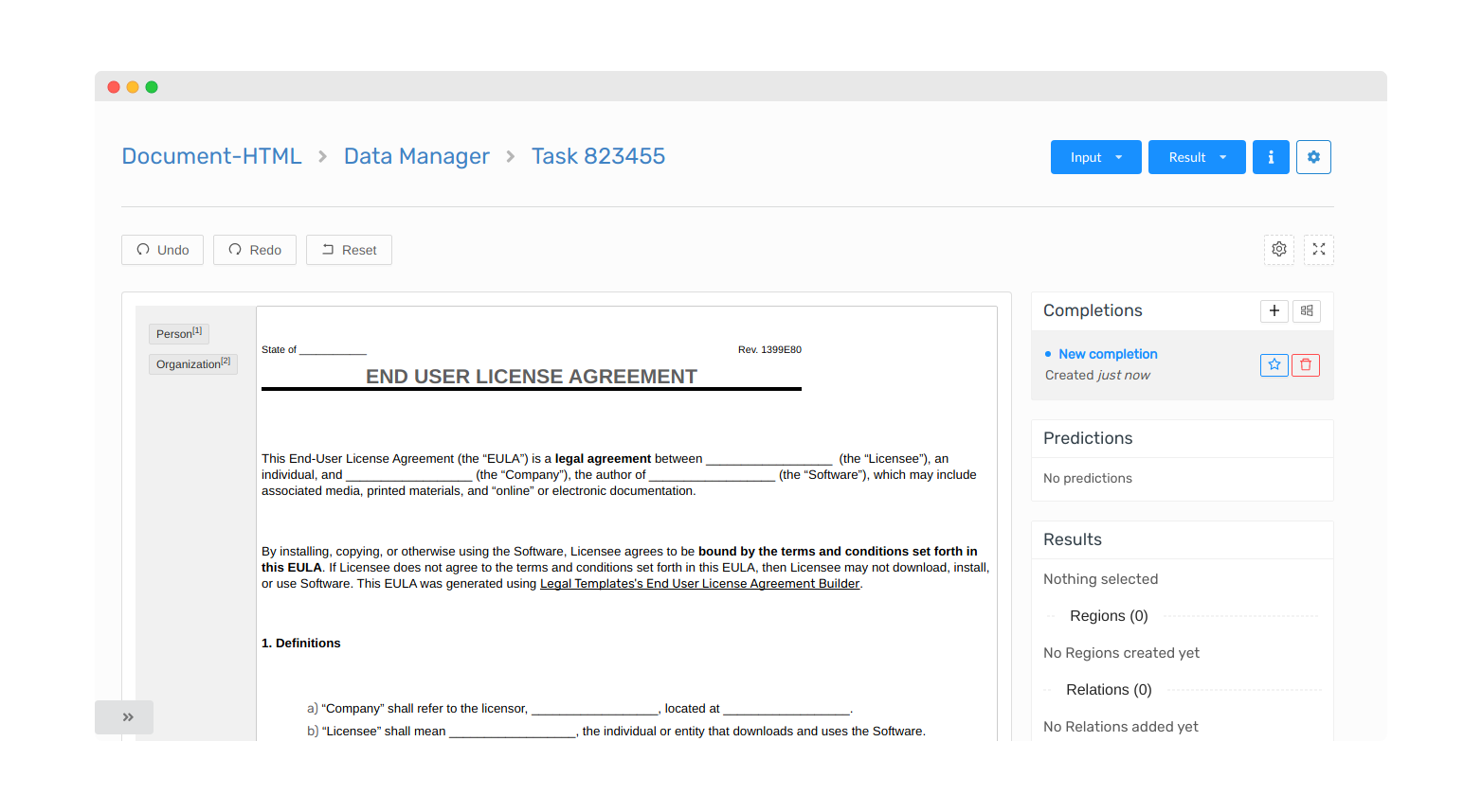
<View style="display: flex; height: 500px; overflow: auto">
  <View style="min-width: 200px; padding: 1em; padding-top: 0; background: #f1f1f1">
  <HyperTextLabels name="ner" toName="text" showInline="false">
    <Label value="Person" />
    <Label value="Organization" />
  </HyperTextLabels>
  </View>
  <View style="border: 1px solid #CCC;
               border-radius: 2px;
               padding: 5px;">
    <HyperText name="text" value="$text" encoding="base64" />
  </View>
</View>
Long Text
When the text is long, you can put it into a scrollable container. To do so, you need to provide a CSS style to the view and limit its height. Any scrollable container will be automatically scrolled to the area of the region when the region from the right side column is selected.
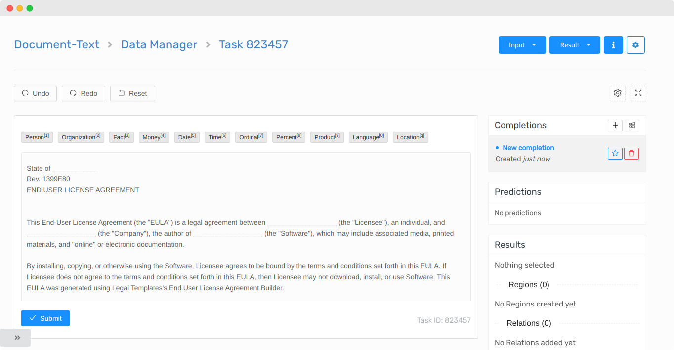
PRO TIP: Use Alt+TAB to iterate through the regions
<View>
  <Labels name="ner" toName="text">
    <Label value="Person" />
    <Label value="Organization" />
  </Labels>
  <View style="height: 300px; overflow: auto">
    <Text name="text" value="$text" />
  </View>
</View>
Large Number of Classes
With a large number of classes, you can use a filter tag that can help you narrow down the labels or choices by their name or alias.
One of the productivity features of a filter tag is an ability to add a hotkey that activates it, and if you hit enter, it selects the top candidate.
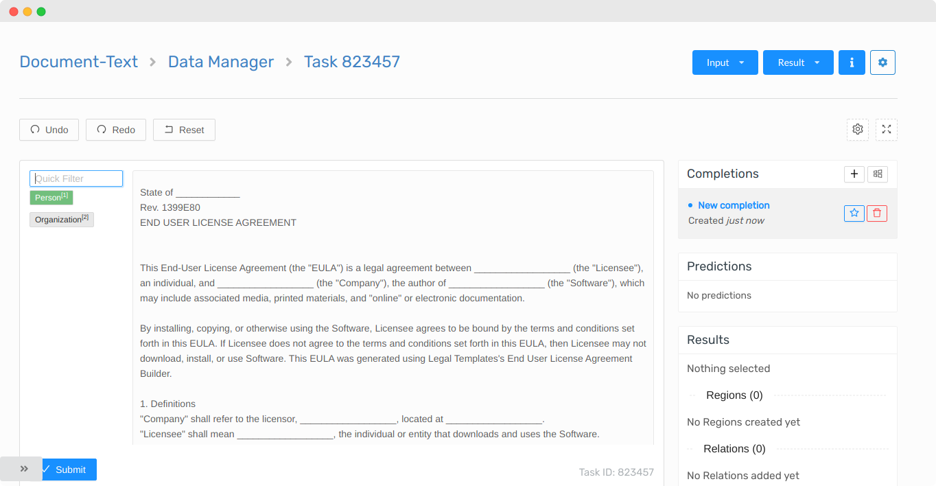
<View style="display: flex;">
  <View style="width: 150px; padding-right: 1em; height: 400px; overflow-y: auto">
    <Filter name="fl" toName="ner" hotkey="shift+f" />
    <Labels name="ner" toName="text" showInline="false">
      <Label value="Person" />
      <Label value="Organization" />
    </Labels>
  </View>
  <View style="height: 400px; overflow: auto">
    <Text name="text" value="$text" encoding="base64" />
  </View>
</View>
Per Region Labeling
You can add additional classes to the regions if you use perRegion attribute with the supported tags, here is an example of the config where the Choices are shown after the annotator creates and selects a region.
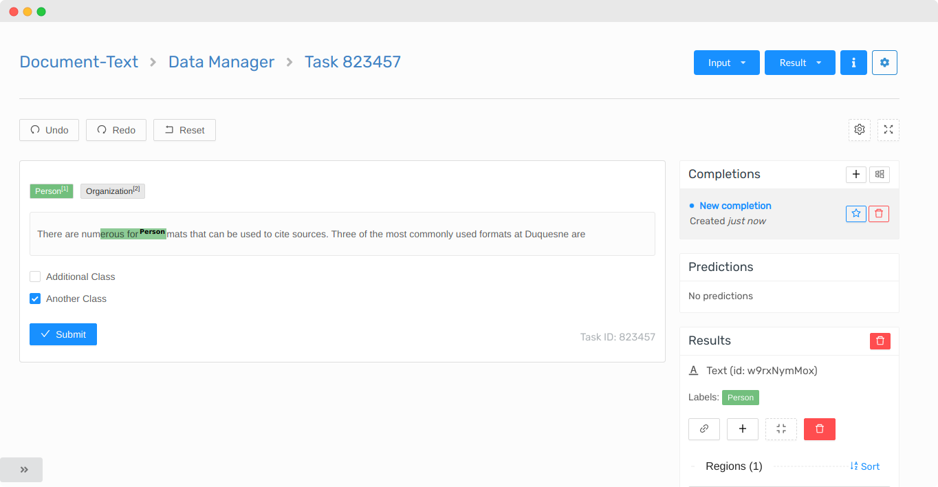
<View>
  <Labels name="ner" toName="text">
    <Label value="Person" />
    <Label value="Organization" />
  </Labels>
  <Text name="text" value="$text" />
  <Choices name="ch" toName="text" perRegion="true">
    <Choice value="Additional Class" />
    <Choice value="Another Class" />
  </Choices>
</View>
You can further configure it to support different classifications based on different label values, for example, if we want to provide Male/Female classes for Person and USD/EUR/GBP for the currency label:
<View>
  <Labels name="ner" toName="text">
    <Label value="Person" />
    <Label value="Currency" />
  </Labels>
  <Text name="text" value="$text" />
  <Choices name="ch" toName="text" perRegion="true" whenLabelValue="Person">
    <Choice value="Male" />
    <Choice value="Female" />
  </Choices>
  <Choices name="ch-2" toName="text" perRegion="true" whenLabelValue="Currency">
    <Choice value="USD" />
    <Choice value="EUR" />
    <Choice value="GBP" />
  </Choices>
</View>
Subclassification
If you’re classifying a piece of information and you want to provide more granular subclasses when the parent class is specified, then you can use visibleWhen attribute on the Choices tag, here is an example:
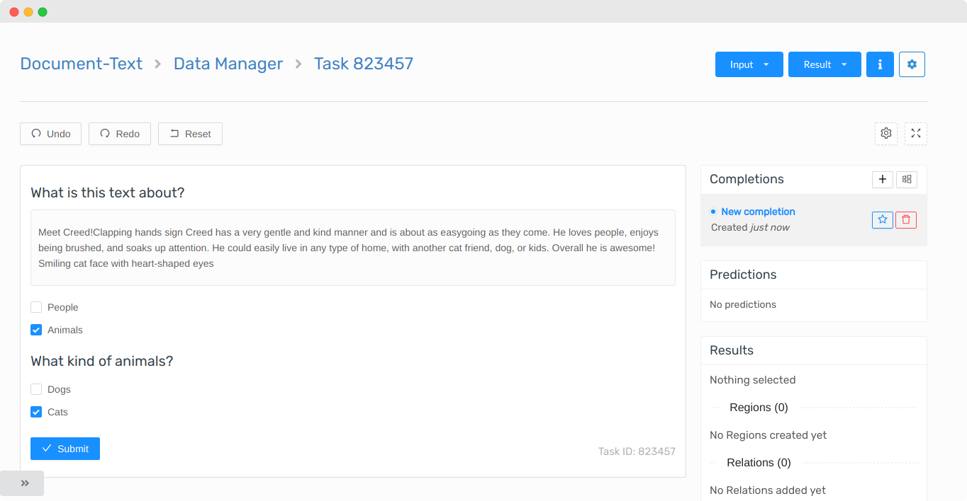
<View>
  <Header value="What is this text about?" />
  <Text name="text" value="$text" />
  <Choices name="ch" toName="text">
    <Choice value="People" />
    <Choice value="Animals" />
  </Choices>
  <Choices name="ch-2" toName="text" visibleWhen="choice-selected" whenTagName="ch" whenChoiceValue="Animals">
    <Header value="What kind of animals?" />
    <Choice value="Dogs" />
    <Choice value="Cats" />
  </Choices>
</View>
Required
Some control tags supprot a required attribute. For example to make any of the Choices tags required to be selected specify it as true; here is a simple example with basic classification.
<View>
  <Text name="text" value="$text" />
  <Choices name="ch" toName="text" required="true" requiredMessage="Please select the checkbox">
    <Choice value="People" />
    <Choice value="Animals" />
  </Choices>
</View>
The required param can be applied to any of the Choices examples in the recipes above.